Emily Oster

9 min Read Emily Oster

Emily Oster

School Dashboard Update

Emily Oster

9 min Read

For much of the summer and early fall, this newsletter focused a lot on schools. School reopening plans, school data collection, child care data, camp data, policy, and on. This culminated in the COVID-19 School Response Dashboard, which I first talked about here and which you can see the current version of here.

By and large, I’ve moved my engagement with these school questions into other forums. I envisioned this newsletter as a way to connect with readers and speak to the questions parents have about their personal and family choices. I didn’t envision it as a policy lever, and I’m happiest writing here about how to think about new studies of toxic metals, or planning family visits in the era of COVID.

But I’ve spent a huge share of the last year working on the question of schools, and a lot of the last six months working on the dashboard, and I know that some readers initially followed this for those topics. So I thought I’d take a little time to update the progress on the dashboard, give a sense of what we are learning, and maybe talk through a few next steps.

This also feels like a good time to do this because both the Biden Education Department and the CDC are launching efforts to collect better data on schools. We’re not involved in those efforts, but I’m hoping by making visible what we’ve put together, those groups can take advantage of what we’ve already learned as they try to put together similar data.

If you’re just here for parenting, don’t worry, that will be back Thursday.

(And if you want a slightly different form of this, see a video of me talking through the dashboard here).

What is this dashboard and where does the data come from?

The COVID dashboard project launched in August, basically in response to a realization by a number of people that schools were starting to open and there was no coordinated federal effort to track COVID cases in context. By “in context” I mean with information on how many people were in in-person school and what mitigation factors allowed school to operate safely. I think for me a key moment came when I saw a tracker for COVID cases in schools with a footnote indicating that the tracker didn’t differentiate between cases in students who were fully remote versus those in-person. This isn’t a great way to understand school risks.

The dashboard focuses on documenting in-person counts and cases among people affiliated with schools. An important limitation of our data is we do not look at where transmission occurred. If people get COVID-19 outside of school but are associated with the school, they appear in our counts. Since we started putting up data, much better contact tracing has come out, which can look at those distinctions in more detail. One implication is that given the risks in the community, we’d expect to see positive COVID rates in our data even if there were no transmission in schools.

When we launched the dashboard in early September, our first announcement included about 100,000 in-person students. All of the data in that wave came from schools and districts that opted-in to the study to provide their information. These data provided a first, early look at case rates in schools. The sample was selected, yes, but it provided a first look at case rates in schools.

The most recent wave of data, covering early February, includes about 12 million students, of whom 6 million were in-person (this is about 20% of all school enrollment in the US). At this stage of the process, we still collect data from districts and schools who opt-in. But we’re also pulling in comprehensive data at either the school or district level from a number of states (New York, Texas, Massachusetts, Florida). The result is data with less geographic balance but significantly more representativeness (and many more observations).

You can browse the dashboard here. It’s possible to filter our main dashboard page by community case rate, by state, by the demographics of the area and by school age group. We’ve provided some comparison community rates, and separated the data by students and staff. In a second tab, we look at mitigation strategies, and in a third we show data for the consistently observed states.

What are Your Big Take-Aways?

When we started this project in August, there was a lot more uncertainty about the safety of schools. One big open question was perhaps best phrased: “Are Schools Super-spreaders?” That is: were were going to see big outbreaks associated with school openings, the way we did with some Universities, ski lodges, or biotech conferences?

The other two central questions we saw early on were: In general, how do school rates compare to community rates? And: to the extent schools are risky, what mitigation factors work to prevent spread?

Our first output from the dashboard really focused on the first question, in part because it was the easiest to answer with limited data. If schools were major super-spread locations, we would expect to see at least some episodes of significant spread in the schools and districts we studied. (One way to see this: early on people also wondered if nursing homes were really locations of a lot of spread. It didn’t take very many nursing homes to know the answer was yes).

Even in the early rounds of data collection, it became clear schools were not super-spreaders. This has been reinforced again and again in our data, in other data, in the lived experience of the last year. So that was the first question.

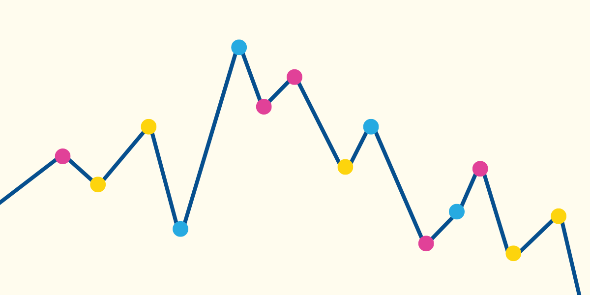
Our data has also allowed us to make some progress on comparing school rates with community rates. The first graph below shows rates in in-person students and staff relative to their matched communities over all of the dashboard data (you’d see similar patterns if you limited to particular states, which you can check out yourself.) The comparison with community rates isn’t exactly apples to apples, since these rates are determined in part by the intensity of testing and the community isn’t demographically matched to teachers or students, but it gives a sense.

In general, we see school rates move with community rates. School staff show up with similar rates to the community, students with lower rates. This is what we would expect if there was relatively little in-school transmission. Basically, schools reflect their communities because staff and students live in these communities.

In the dashboard, you can see this pattern showing up across areas, and across demographics. Areas in our data with larger minority populations show the same patterns.

The last big question is on mitigation, and here I think we have made some progress but not enough. The graph below shows one example — the differences in student and staff rate in various community rate bins based on whether the areas had mask mandates for students. This makes it look like masks matter a lot (which I think they likely do) but we also have relatively few areas without these mandates.

Mitigation is difficult to study with these data, or most data on schools, because so many mitigation factors move together. Places with mask mandates are also likely to have more distancing, to have ventilation improvements, etc. In addition, when we pull in data from states, we have to separately collect mitigation from reading district plans. This is slow. At the same time, this is a critical set of questions to understand better, given the guidance districts need now and, possibly, into the fall.

Limitations

It would be remiss to leave the big take-away discussion without touching on limitations of our data, of which there are many. We do not have all states, partly because many of them do not collect these data, and partly because we’re still working. There isn’t as much data as we’d like on large urban districts (in part because many are not open yet).

Our community rate comparisons are also not perfect. Neither the community case rate nor the positivity rate is quite the right apples-to-apples, so we are left a little lacking in our ability to get fine-grained answers to question about whether rates in schools are a little higher or lower than a comparison group.

Most significantly, I think, we do not have contact tracing data here, so we really cannot say more about where people are getting COVID-19, whether there is transmission in school, and how much.

Closely related to this is the fact that we rely — even in the data reported by states — on what is reported by schools. They, in turn, rely on testing and reporting from people at school. Schools are for the most part not doing universal testing (nor is the community, for that matter) so cases may be missed. This is a limitation of all data in this space.

What our data is useful for, I think, is the big picture. And that big picture says, basically: Schools aren’t super-spreaders and school rates reflect community rates.

What’s Next?

We are continuing our data collection efforts, including attempting to bring in data from more states. I anticipate continuing these efforts through the end of the school year. Hopefully more schools will open, and we’ll expand our geographic reach. Also on the data side, we’re working on improving our mitigation data to cover more of our sample.

Other clear next steps involve using these data for research. There are questions about schools and COVID, but also about learning, about impacts on communities, about labor force participation for women, etc, etc. I’m hoping we’ll be able to do more of this, with our team and others gong forward.

I see a long-term role for these data, ideally combined with others, in helping us unpack the long term impacts of the pandemic on kids. One of my goals in the next months is to see if we can bring together a number of piece of data from many sources to create a kind of data hub that researchers could access in the future.

Covid-19 rapid antigen tests arranged in a pattern on a yellow background.

Feb 20 2023

12 min read

COVID-19: Where to Go from Here

A long-term view of the virus

Emily Oster
Covid-19 rapid antigen tests arranged in a pattern on a yellow background.

Oct 20 2022

9 min read

Should You Get the Bivalent Booster?

The latest on the risks and benefits of COVID vaccines boosters for older adults, pregnant people, and kids

Emily Oster
A line graph with pink, yellow, and blue dots representing life's ups and downs.

Aug 16 2022

3 min read

Wins, Woes, and Doing It Again

We have our first story from a dad! And it’s a good one. 10/10 —Girl Dad with Confidence Growing by Read more

Emily Oster
Covid-19 rapid antigen tests arranged in a pattern on a yellow background.

Aug 15 2022

8 min read

Updated CDC Guidelines for School and Child Care

NO QUARANTINES!!!

Emily Oster

Instagram

left right
I hear from many of you that the information on ParentData makes you feel seen. Wherever you are on your journey, it’s always helpful to know you’re not alone. 

Drop an emoji in the comments that best describes your pregnancy or parenting searches lately… 💤🚽🍻🎒💩

I hear from many of you that the information on ParentData makes you feel seen. Wherever you are on your journey, it’s always helpful to know you’re not alone.

Drop an emoji in the comments that best describes your pregnancy or parenting searches lately… 💤🚽🍻🎒💩
...

Milestones. We celebrate them in pregnancy, in parenting, and they’re a fun thing to celebrate at work too. Just a couple years ago I couldn’t have foreseen what this community would grow into. Today, there are over 400,000 of you here—asking questions, making others feel seen wherever they may be in their journey, and sharing information that supports data > panic. 

It has been a busy summer for the team at ParentData. I’d love to take a moment here to celebrate the 400k milestone. As I’ve said before, it’s more important than ever to put good data in the hands of parents. 

Share this post with a friend who could use a little more data, and a little less parenting overwhelm. 

📷 Me and my oldest, collaborating on “Expecting Better”

Milestones. We celebrate them in pregnancy, in parenting, and they’re a fun thing to celebrate at work too. Just a couple years ago I couldn’t have foreseen what this community would grow into. Today, there are over 400,000 of you here—asking questions, making others feel seen wherever they may be in their journey, and sharing information that supports data > panic.

It has been a busy summer for the team at ParentData. I’d love to take a moment here to celebrate the 400k milestone. As I’ve said before, it’s more important than ever to put good data in the hands of parents.

Share this post with a friend who could use a little more data, and a little less parenting overwhelm.

📷 Me and my oldest, collaborating on “Expecting Better”
...

I spend a lot of time talking people down after they read the latest panic headline. In most cases, these articles create an unnecessary amount of stress around pregnancy and parenting. This is my pro tip for understanding whether the risk presented is something you should really be worrying about.

Comment “link” for an article with other tools to help you navigate risk and uncertainty.

#emilyoster #parentdata #riskmanagement #parentstruggles #parentingstruggles
...

Here’s why I think you don’t have to throw away your baby bottles.

Here’s why I think you don’t have to throw away your baby bottles. ...

Drop your toddlers favorite thing right now in the comments—then grab some popcorn.

Original thread source: Reddit @croc_docs

Drop your toddlers favorite thing right now in the comments—then grab some popcorn.

Original thread source: Reddit @croc_docs
...

Just keep wiping.

Just keep wiping. ...

Dr. Gillian Goddard sums up what she learned from the Hot Flash  S e x  Survey! Here are some key data takeaways:

🌶️ Among respondents, the most common s e x u a l frequency was 1 to 2 times per month, followed closely by 1 to 2 times per week
🌶️ 37% have found their sweet spot and are happy with the frequency of s e x they are having
🌶️ About 64% of respondents were very or somewhat satisfied with the quality of the s e x they are having

Do any of these findings surprise you? Let us know in the comments!

#hotflash #intimacy #midlifepleasure #parentdata #relationships

Dr. Gillian Goddard sums up what she learned from the Hot Flash S e x Survey! Here are some key data takeaways:

🌶️ Among respondents, the most common s e x u a l frequency was 1 to 2 times per month, followed closely by 1 to 2 times per week
🌶️ 37% have found their sweet spot and are happy with the frequency of s e x they are having
🌶️ About 64% of respondents were very or somewhat satisfied with the quality of the s e x they are having

Do any of these findings surprise you? Let us know in the comments!

#hotflash #intimacy #midlifepleasure #parentdata #relationships
...

Should your kid be in a car seat on the plane? The AAP recommends that you put kids under 40 pounds into a car seat on airplanes. However, airlines don’t require car seats.

Here’s what we know from a data standpoint:
✈️ The risk of injury to a child on a plane without a carseat is very small (about 1 in 250,000)
✈️ A JAMA Pediatrics paper estimates about 0.4 child air crash deaths per year might be prevented in the U.S. with car seats 
✈️ Cars are far more dangerous than airplanes! The same JAMA paper suggests that if 5% to 10% of families switched to driving, then we would expect more total deaths as a result of this policy. 

If you want to buy a seat for your lap infant, or bring a car seat for an older child, by all means do so! But the additional protection based on the numbers is extremely small.

#parentdata #emilyoster #flyingwithkids #flyingwithbaby #carseats #carseatsafety

Should your kid be in a car seat on the plane? The AAP recommends that you put kids under 40 pounds into a car seat on airplanes. However, airlines don’t require car seats.

Here’s what we know from a data standpoint:
✈️ The risk of injury to a child on a plane without a carseat is very small (about 1 in 250,000)
✈️ A JAMA Pediatrics paper estimates about 0.4 child air crash deaths per year might be prevented in the U.S. with car seats
✈️ Cars are far more dangerous than airplanes! The same JAMA paper suggests that if 5% to 10% of families switched to driving, then we would expect more total deaths as a result of this policy.

If you want to buy a seat for your lap infant, or bring a car seat for an older child, by all means do so! But the additional protection based on the numbers is extremely small.

#parentdata #emilyoster #flyingwithkids #flyingwithbaby #carseats #carseatsafety
...

SLEEP DATA 💤 PART 2: Let’s talk about naps. Comment “Link” for an article on what we learned about daytime sleep!

The first three months of life are a chaotic combination of irregular napping, many naps, and a few brave or lucky souls who appear to have already arrived at a two-to-three nap schedule. Over the next few months, the naps consolidate to three and then to two. By the 10-to-12-month period, a very large share of kids are napping a consistent two naps per day. Over the period between 12 and 18 months, this shifts toward one nap. And then sometime in the range of 3 to 5 years, naps are dropped. What I think is perhaps most useful about this graph is it gives a lot of color to the average napping ages that we often hear. 

Note: Survey data came from the ParentData audience and users of the Nanit sleep monitor system. Both audiences skew higher-education and higher-income than the average, and mostly have younger children. The final sample is 14,919 children. For more insights on our respondents, read the full article.

SLEEP DATA 💤 PART 2: Let’s talk about naps. Comment “Link” for an article on what we learned about daytime sleep!

The first three months of life are a chaotic combination of irregular napping, many naps, and a few brave or lucky souls who appear to have already arrived at a two-to-three nap schedule. Over the next few months, the naps consolidate to three and then to two. By the 10-to-12-month period, a very large share of kids are napping a consistent two naps per day. Over the period between 12 and 18 months, this shifts toward one nap. And then sometime in the range of 3 to 5 years, naps are dropped. What I think is perhaps most useful about this graph is it gives a lot of color to the average napping ages that we often hear.

Note: Survey data came from the ParentData audience and users of the Nanit sleep monitor system. Both audiences skew higher-education and higher-income than the average, and mostly have younger children. The final sample is 14,919 children. For more insights on our respondents, read the full article.
...

Happy Father’s Day to the Fathers and Father figures in our ParentData community! 

Tag a Dad who this holiday may be tricky for. We’re sending you love. 💛

Happy Father’s Day to the Fathers and Father figures in our ParentData community!

Tag a Dad who this holiday may be tricky for. We’re sending you love. 💛
...

“Whilst googling things like ‘new dad sad’ and ‘why am I crying new dad,’ I came across an article written by a doctor who had trouble connecting with his second child. I read the symptoms and felt an odd sense of relief.” Today we’re bringing back an essay by Kevin Maguire of @newfatherhood about his experience with paternal postpartum depression. We need to demystify these issues in order to change things for the better. Comment “Link” for a DM to read his full essay.

#parentdata #postpartum #postpartumdepression #paternalmentalhealth #newparents #emilyoster
...

What does the data say about children who look more like one parent? Do they also inherit more character traits and mannerisms from that parent? Let’s talk about it 🔎

#emilyoster #parentdata #parentingcommunity #lookslikedaddy #lookslikemommy

What does the data say about children who look more like one parent? Do they also inherit more character traits and mannerisms from that parent? Let’s talk about it 🔎

#emilyoster #parentdata #parentingcommunity #lookslikedaddy #lookslikemommy
...

SLEEP DATA 💤 We asked you all about your kids’ sleep—and got nearly 15,000 survey responses to better understand kids’ sleep patterns. Comment “Link” for an article that breaks down our findings!

This graph shows sleeping location by age. You’ll notice that for the first three months, most kids are in their own sleeping location in a parent’s room. Then, over the first year, this switches toward their own room. As kids age, sharing a room with a sibling becomes more common. 

Head to the newsletter for more and stay tuned for part two next week on naps! 🌙

#parentdata #emilyoster #childsleep #babysleep #parentingcommunity

SLEEP DATA 💤 We asked you all about your kids’ sleep—and got nearly 15,000 survey responses to better understand kids’ sleep patterns. Comment “Link” for an article that breaks down our findings!

This graph shows sleeping location by age. You’ll notice that for the first three months, most kids are in their own sleeping location in a parent’s room. Then, over the first year, this switches toward their own room. As kids age, sharing a room with a sibling becomes more common.

Head to the newsletter for more and stay tuned for part two next week on naps! 🌙

#parentdata #emilyoster #childsleep #babysleep #parentingcommunity
...

Weekends are good for extra cups of ☕️ and listening to podcasts. I asked our team how they pod—most people said on walks or during chores. What about you?

Comment “Link” to subscribe to ParentData with Emily Oster, joined by some excellent guests.

#parentdata #parentdatapodcast #parentingpodcast #parentingtips #emilyoster
...